 I know that it’s things like font and size i know there is type faces called black letter which was one of the first typefaces .typography is the art of making letters in the video i watched about typefaces they said it could even be an art form helping someone express themselves this is why some typefaces have a kinda mood attached to them.How do people make or make sure no one else can make there typeface and claim they made it first.What has been done already that one would think is original like 8 bit.I’m getting info from things like images that show typefaces that gives me inspiration or an idea like the fonts used in slasher or the fonts that are used in album covers.

The problem is making an original typeface with something unique tied to it.I also have to follow all of the requirements and constraints.The requirements are i have to make an typeface that’s original to me.I have to do everything by their due date.I have to be doing something in class because there is always something to do in class. My constraints are i can only use pencils ,I can only use straight lines, No shading ,and all things have to be the same height and width.I’m using it to know where to steer away from and how to form my own typefaces i saw the past typefaces that other students made, and from this info i should be able to make the best typeface i can possible make.


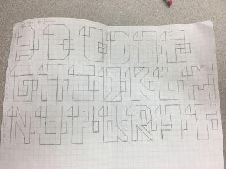
All of these design are very different they all have of their own unique style and feel they are very good looking.Almost of them were made using straight line and all of them had no curves.I know most of them were not used in the finish project but i did put time in them and i think that shows and the failures of the first sketches helped me make the one that worked at the end. I think that all of these design were creative but they are not very practical in real life situation like where is anyone gonna use this blocky text.other than like in a video game or something i really wish while making these typefaces i could have made something someone else could really use you know. I think the design that work worked because i think at this point i really started to understand what this unit was really trying to teach me i think when i started to follow the instruction more closely i got the typeface right.i think the factor which was the most important thing that helped me decide is how miss ward and miss Balogun felt about it if they thought it wasn’t that good i knew i could do better and i did.

I needed a ruler,my school id,a mechanical pencil and a lot of graph paper.i needed the a ruler and my ID because i needed to draw straight line for my typeface.i needed the mechanical pencil because i think for me they are better for drawing lines then just regular lead pencils.I ran into problems like having to use a ruler and struggling to make a better design that fitted the big graph paper without ruining the old design. I also needed to change the size of the letters for big graph paper which slowed me down.I also think that time was a problem for me cause i had to finish this work and some other work in foundation physics but i came after school to finish the work and that sorted everything out.I also think me talking was a problem because i talk a lot which distracts me and other but i solved this problem by just moving my self away from my group of friends till i finish my work.

Yeah it meets the requirements i really worked hard with my teachers and peers to make sure everything i did was the proper thing to do from the shape of the letter to the look and even the vibe the letter let off i made sure everything was just right.I did meet all of the constraints from the due dates to the no curves rule and the size of the letter constraints .To me these constraints were really not that big of a deal i just except for the curves at the beginning because my original idea was to make like some kind of animal or thing in the shapes of letters.the sizing was also a problem at the start of the unit when i didn’t know what my teachers meant by it.Maybe make everything a little bit more clean and maybe change the size and the shape of some letter like f and p i just feel like if i had a class block dedicated to improving some letters i could have really made my typeface a little bit more better .
Artist Statement
My typeface looks very different and unique in my opinion having the two defining feature on the top and middle part of the letter. But I Don’t think this would be a very practical font to use in everyday use I think it would work for special things like a banner or in a video game as text i think that would work for this typeface. The name of my typeface is binding text I choose this name because of a game called binding of Isaac which has a lot of weird and different texts on the wall of the dungeons. my typeface was made with multiple lead pencils, rulers, and my school ID it took me about eight days to make a successful typeface and to transfer the idea to big graph paper then to bristle paper. At first I used my hands to draw the straight line which set me back because miss Balogun insisted that I needed to use a ruler or school ID, in the long run, this helped me out when I moved to the bristle paper because what I didn’t realize is that the mistakes I made with my hand would transfer to the finished version that I would present. I think while creating this typeface I learned a lot about our school core values like risk-taking and how to be perseverant while facing a difficult challenge. I am happy with my finished project even though I didn’t think this would be the end result I’m proud of my work and how diligent I was from staying after school and spending my academic coaching block finishing the work I was very determined to get this work done and I did.